Medieval Logos – the Antoniewicz coat of arms
March 22, 2016
Marketing is a phrase that is fairly new if you take it in relation to the history of the rest of the world, but we certainly think of it as a 20
th century phenomenon. The truth is, marketing has been around almost as long as man has. No, I don’t think homo erectus went round wearing billboards made out of hemp or handed out handwritten leaves at the local watering hole, but they did cave paint. Not only did they cave paint, they cave painted to tell stories, to instruct and to inform. From those humble beginnings we have the multibillion dollar giant that we have today.
Trying to find out the path that marketing has taken over the history of time isn’t easy, but one period where marketing meant everything was in Europe in the middle ages. Logos were everywhere! If you didn’t have one, you were a ‘nobody’, a serf, a peasant. In almost every country in Europe the political, religious and social hierarchy ran on a complicated system of personal branding, the medieval logo – or to you and me, the coat of arms.
The coat of arms began in
the early middle ages as a tool for identifying the opposing sides in battle, both during and after the event. They were worn on the ‘surcoat’, or tunic that stopped the glare off the armour, (hence the term ‘coat of arms’) and signified family, adoption, allegiance, property and after a few evolutions, profession (originally gentlemen didn’t have professions, being a gentleman
was their profession).
Coat of arms were so important that it used its own language to identify the parts of it, ran to a strict code and even has it’s classification – studying this personal branding is called Heraldry. The use of a coat of arms was regulated and accepted as proof of identity on legal documents by use of a seal. Carrying a flag, or pennant, with the coat on was only allowed by someone entitled to bear that design or it was illegal.
The design of this particular, extremely successful part of personal branding, all follow the same rules. A traditional coat of arms had a patterned shield decorated with a crest (design was usually a flower or animal above the helmet), a helmet (designers choice, but in rare occasions denotes a peer of the realm), a motto (designers choice, but usually a banner with wording above or below the design), a crown, supporters (look for two animals either side of the shield holding it up), a wreath (a two coloured rope or flourish in the family’s chosen colours) and a mantling (the thick piece at the bottom of a helmet that covers the neck and upper shoulders). All these elements have their own language and descriptions, but when a coat of arms is being described in words it is known a ‘
Blazon of arms’.
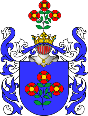
Antoniewicz coat of arms

Photo credit: Wikipedia
This is the Antoniewicz coat of arms. They were a Polish family of Armenian descent in medieval Europe and used this coat of arms as their personal branding. If you’re wondering why a family would need a coat of arms rather than ‘Antoniewicz’ plastered over their uniforms David Beckham style, it’s because not only did give gravitas to their families power, but also was recognizable by those who couldn’t read or speak Polish. Just like a logo, a coat of arms was a universal image that most people could understand.
The design elements of the coat were so strict, but well known, it was easy to interpret, reconstruct or recognize. You can see from another interpretation of the same crest still carries the same information in the same format.
Not only did the layout follow a set pattern, so did the colouring and the elements used.
In
heraldry colours were limited by the availability of products. The metal was either Gold, called ‘Or’, or silver or white, called ‘argent’, as they were the most common. Colours, or ‘tinctures’ were most commonly red (‘gules’), blue (azure) and sometimes black (sable), but it wasn’t as common as it had a tendency to fade and look like azure. Green (vert) was very unusual and only really appeared on the most wealthy of arms as it was very expensive and had to be bought over from Sinop by the Dead Sea in Turkey. Purple (purpure) was almost non-existent as it was derived from a very rare shellfish called the murex which was hard to find.
The Antoniewicz coat of arms was made up of blue, white, silver, gold and red (with a touch of green that could be optional depending on availability!). These colours were chosen for their symbolism:
- Red (gules) – eagerness to serve his country
- White/silver (argent)– Cleanliness, wisdom, peace and joy
- Gold (or) – understanding respect and virtue
- Blue (azure) – Steadfastness, truth and loyalty
- Green (vert) – Freedom, beauty, hope and loyalty
The tradition continues today with marketing. Colours dictate moods or feelings and this is capitalized by graphic design to encourage people to ‘buy’. This psychological use of colour has been used for centuries.
The details used on the coat of arms are also symbolic. The Antoniewicz used a rose, a crown, a chain
- Rose – hope and joy. With red petals, it is a symbol of grace, beauty, and sometimes martyrdom. It is
also a sign of the seventh son.
- Crown – denotes victory, sovereignty, success and empirical.
- Chain – represents contentment in wealth and importance
Everything little detail on a coat of arms was well thought and said something about the bearer. It truly was the first example of the power of excellent logo and branding. The only difference is that marketers don’t use as much jargon as the heraldry system does (believe it, or believe it not)! The blazon (the written description of the coat of arms) would have been:
‘Arms: Azure, three rose gules, centres or, leaves verre.
Crest: Crown or, three rose gules, centres or, leaves verre.’
This would be read by the graphic designer as:
‘Plain blue shield, with three red roses in the middle with gold centres, a bit of foliage to compliment.
At the top of shield, a helmet (not important style) wearing a gold crown, and the same three roses above that.’
Which pretty much hits the spot as it would produce a pretty exact replica as the designs were all to a set pattern. A rose was a rose. They really were the first people to realise the power of a recognizable image and made the most of it.
 Talk to a person


